- 133
- 230
- 12
Just a heads up: Jude is on hiatus until the webtoon contest is over. Then it's back to posting the last tues/weds of the month.
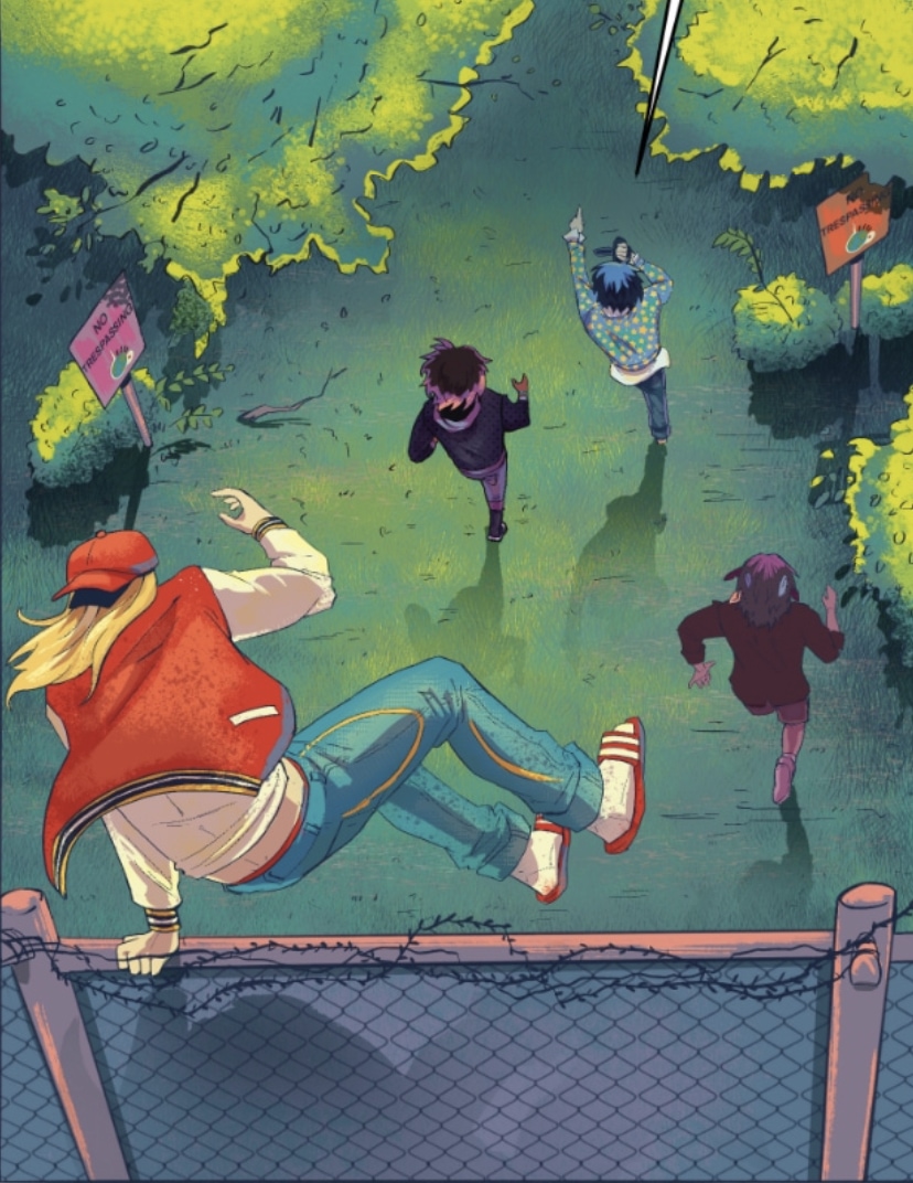
sharing my favorite panel from the latest jude update. this one took specter7 n i forever. so many maxes. so many rocks. so many colors. there were times when i thought it wasnt worth it..... i couldnt power thruough... but i did. and now we have one big beautiful panel that will be scrolled past exponentially fast by readers. it was all worth it.

This panel feels so cool!
Our banner is officially down, what a crazy cool experience!! Thank you to team tapas for supporting us like that!
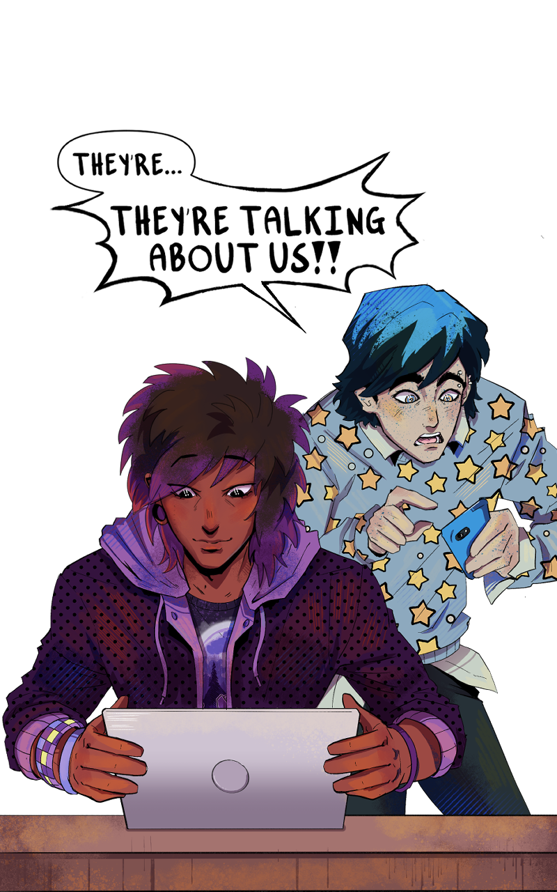
JUDE ALL-MIGHTY HAS A BANNER UP!! MY CO CREATOR AND I ARE SO EXCITED. IF YOU SEE IT, LET ME KNOW!!!
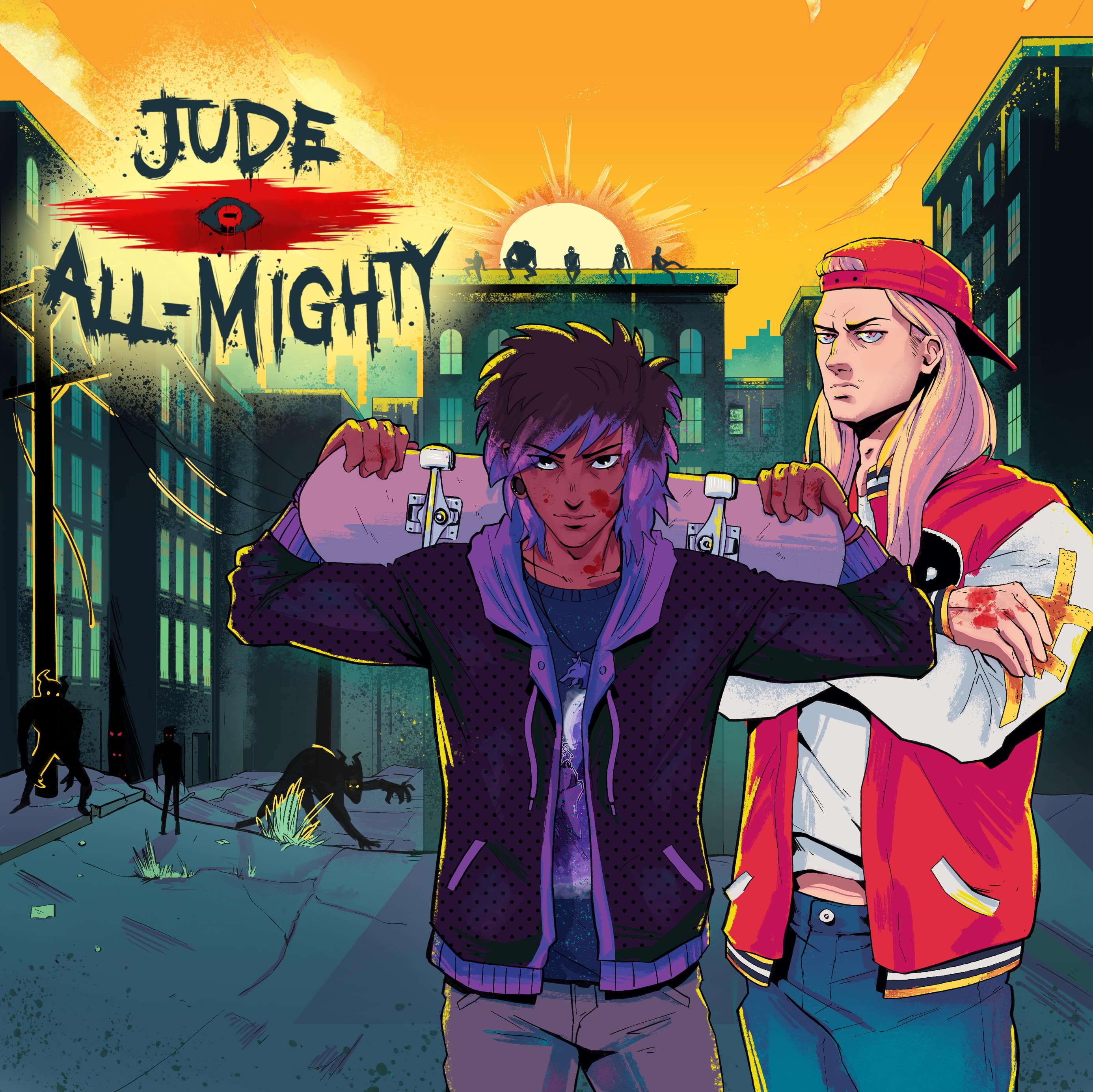
ANOTHER EPISODE OF JUDE IS OUT. Say hello to our blue character. Here’s the best panel (in my opinion) (the right opinion)
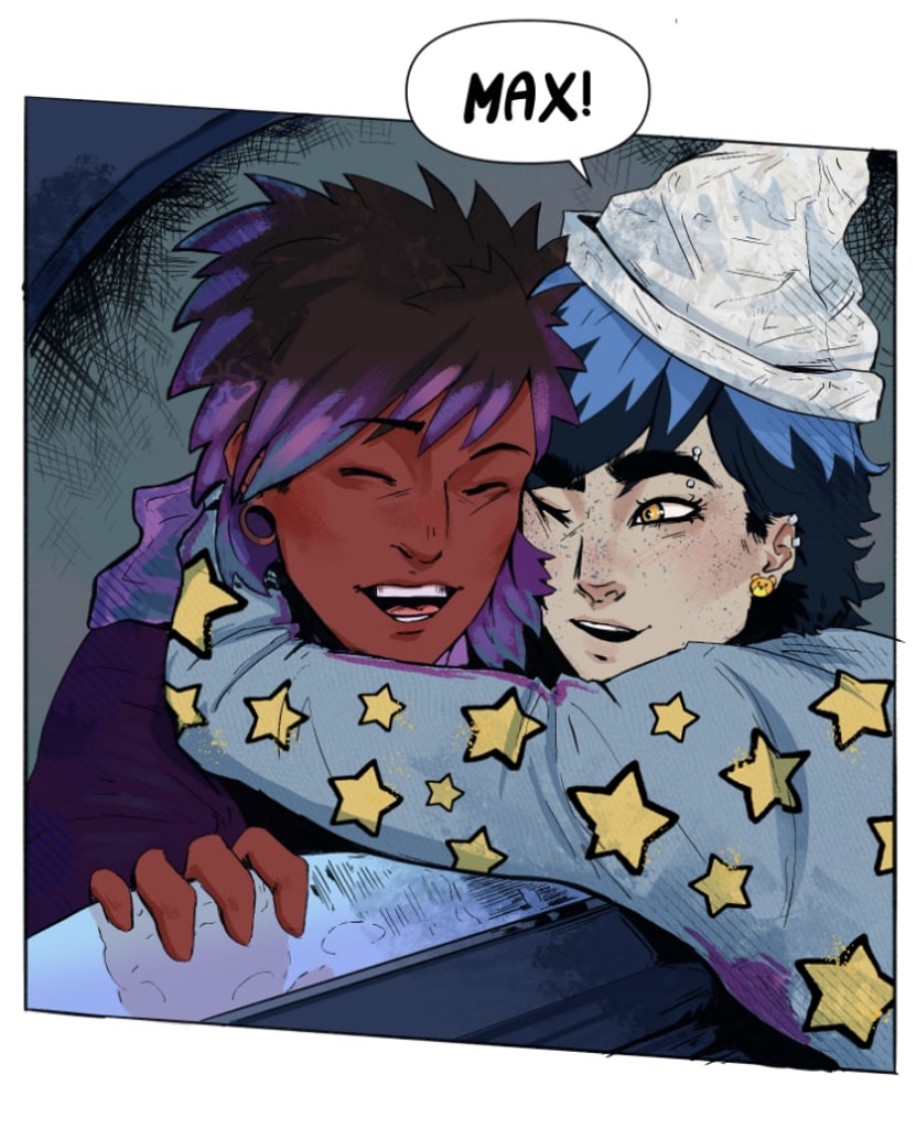
HEY EVERYONE. Update is out. Another one coming sooner than usual to make up for it being shorter than usual. I wanted to make it longer but it kept having a strange ending spot and the following episode a strange starting one if I cut it any longer.
Anyways
Here’s some winter promo art of the Jude all mighty guys :)
Anyways
Here’s some winter promo art of the Jude all mighty guys :)
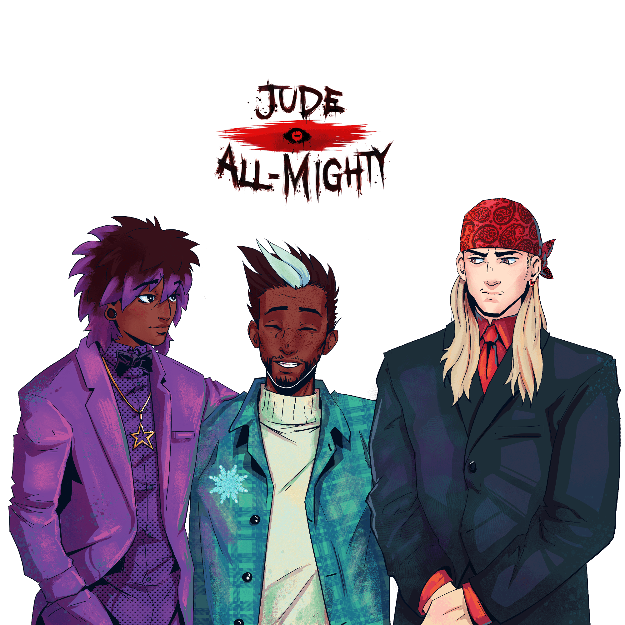
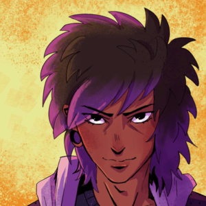
Max MIGHT like purple
Along with the release of chapter 3 ( go check it out!!!) I have also updated Pinkman's cover and banner! What do you think?
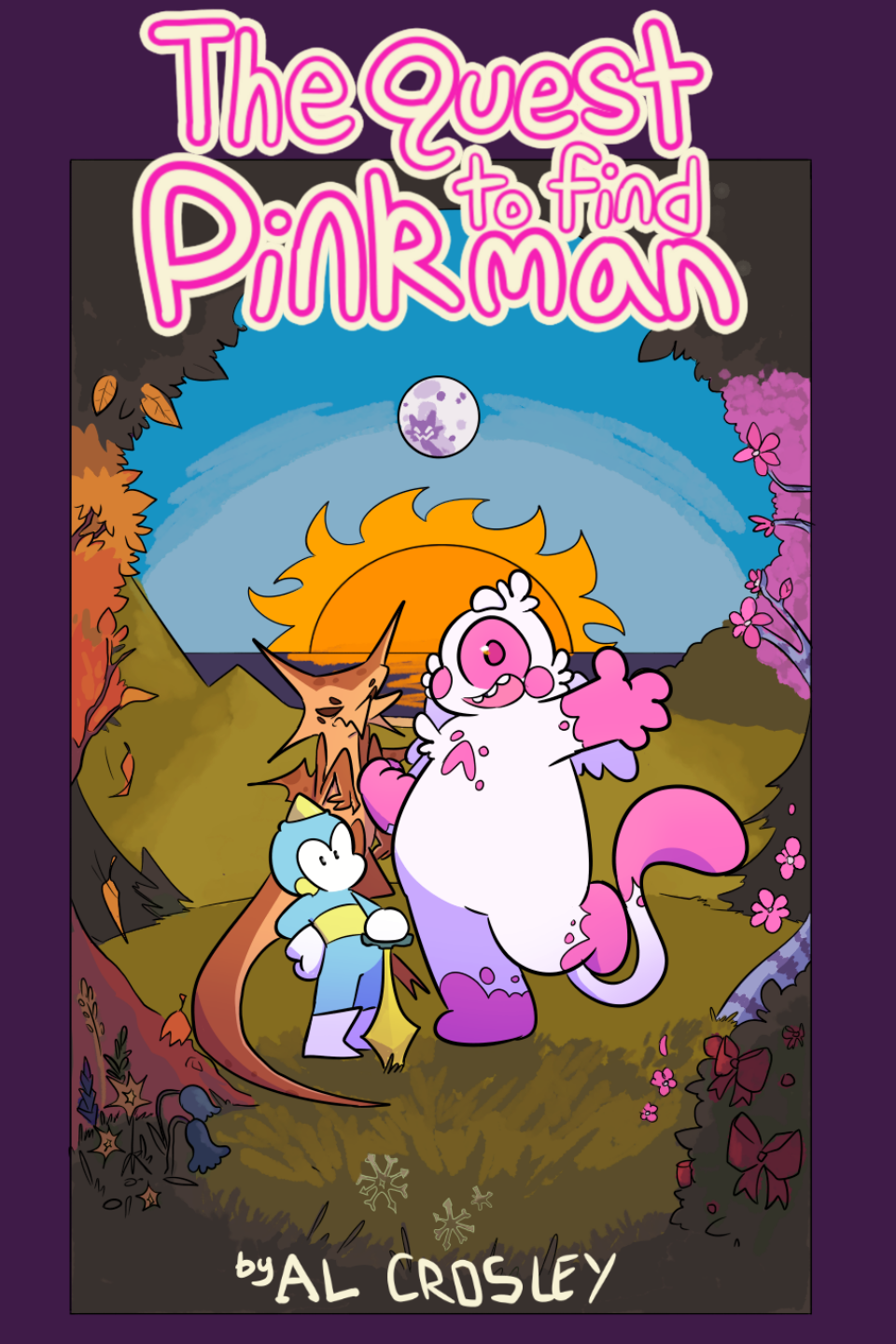
THIS LOOKS AWESOME!! I love the colors for the bg, the palette is really pretty — total fall vibes :o. The characters also pop out really nice without breaking too far from the cohesion of the background. And I’ll go check out your new chapters now! I don’t have the tapas app so I don’t get notified when people post so thank you for letting me know!
OMG thank you so much!! I am so glad you like it cause I spent a while on it.. messing with colors and those glorious mutiply/overlay layers lol. I actually got the idea to post from you, because I didn't know that was a Tapas feature until I subbed 2 Jude Almighty. XP
Haha I also had no idea this was a thing!! I only ever use the site version and I don’t think a wall exists on the app (or at least I cant find it). But it’s a super cool feature. And if you ever want to talk colors for pages or big spreads let me know 👀 it’s my favorite part
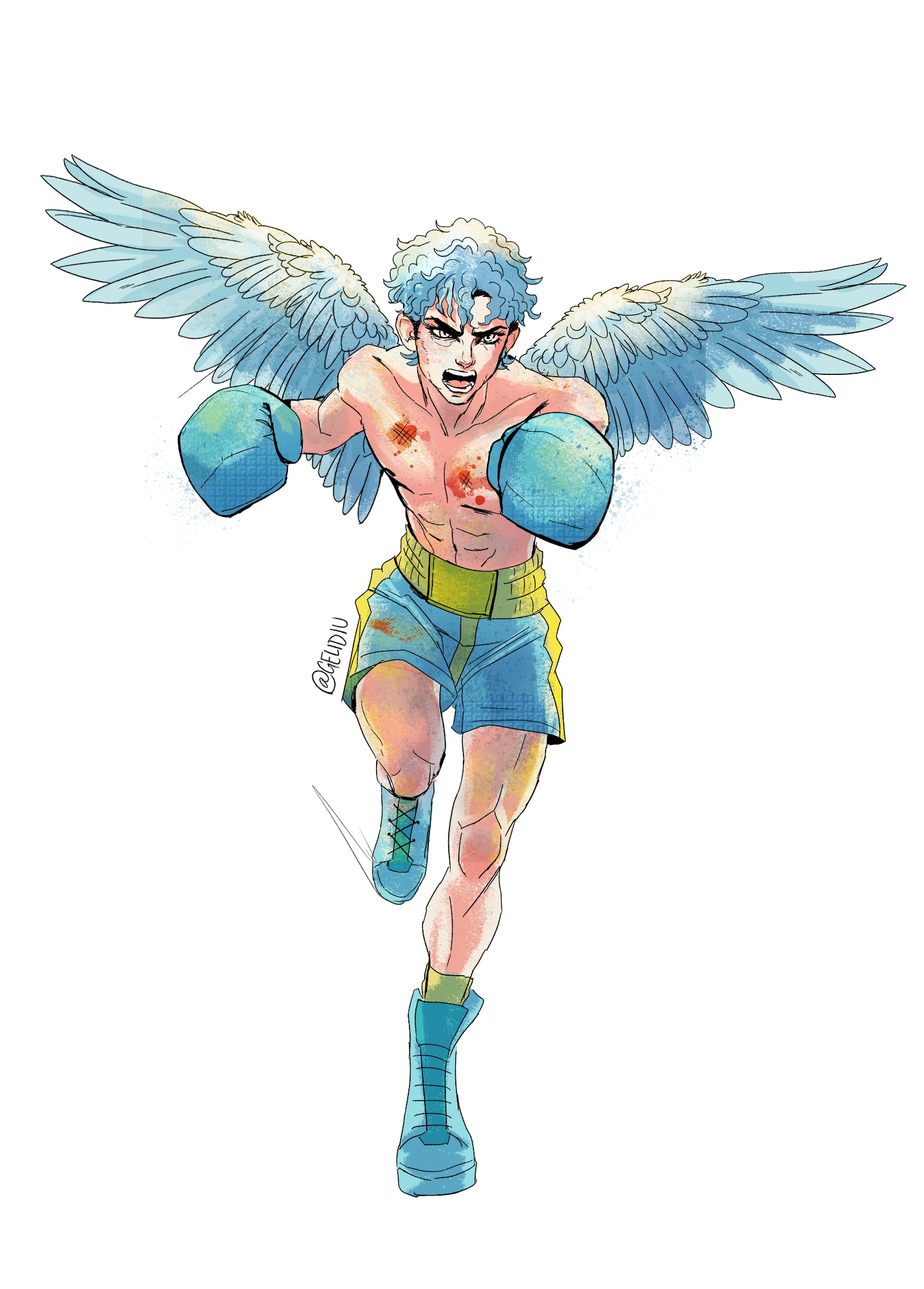
NEW JUDE IS UP!! Come read EP7 if you wanna see more of Max's dad. Also TY tapas for the features the last couple weeks!! Here's some art to celebrate:


