Franz Vanderlinde
Joined Feb 2016 Montréal, Canada
I am a Brazilian writer/comic artist that lives in Québec. I decided to write Abismos so I could learn comics by doing.
Tools
Brush, Ink, watercolors and Krita
- 1.5k
- 623
- 7
I self-published a print version of Abismos! It comprises chapter 1-6 reformatted to fit a more standard comic book.
Get one now: https://ko-fi.com/franzvanderlinde/shop
Check it out! I expect to start shipping orders in January.
For those who follow my comics in PT-BR in the website, I am working on getting a print version in Brazil next year!
Happy holidays!
Get one now: https://ko-fi.com/franzvanderlinde/shop
Check it out! I expect to start shipping orders in January.
For those who follow my comics in PT-BR in the website, I am working on getting a print version in Brazil next year!
Happy holidays!
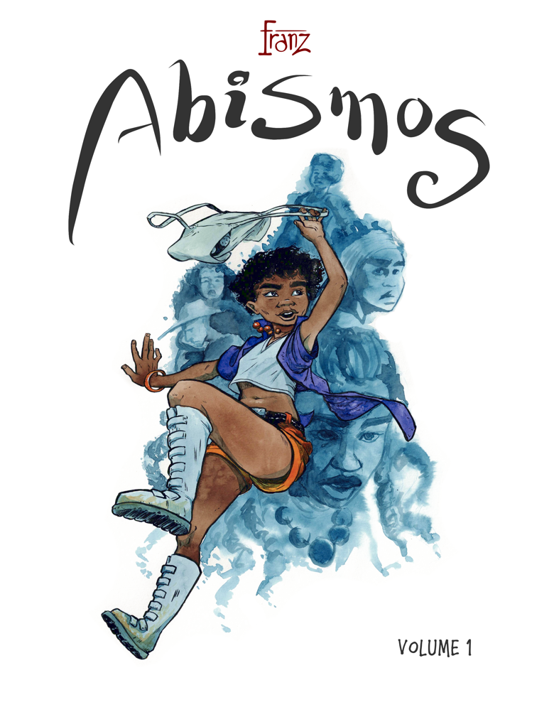
I am testing a new format for Abismos. I am working with bigger paper and decided to try it in portrait mode this time, maybe it fits better with the vertical flow. I kept my color style on this one at least. What do you think? Do you need to see it with text?
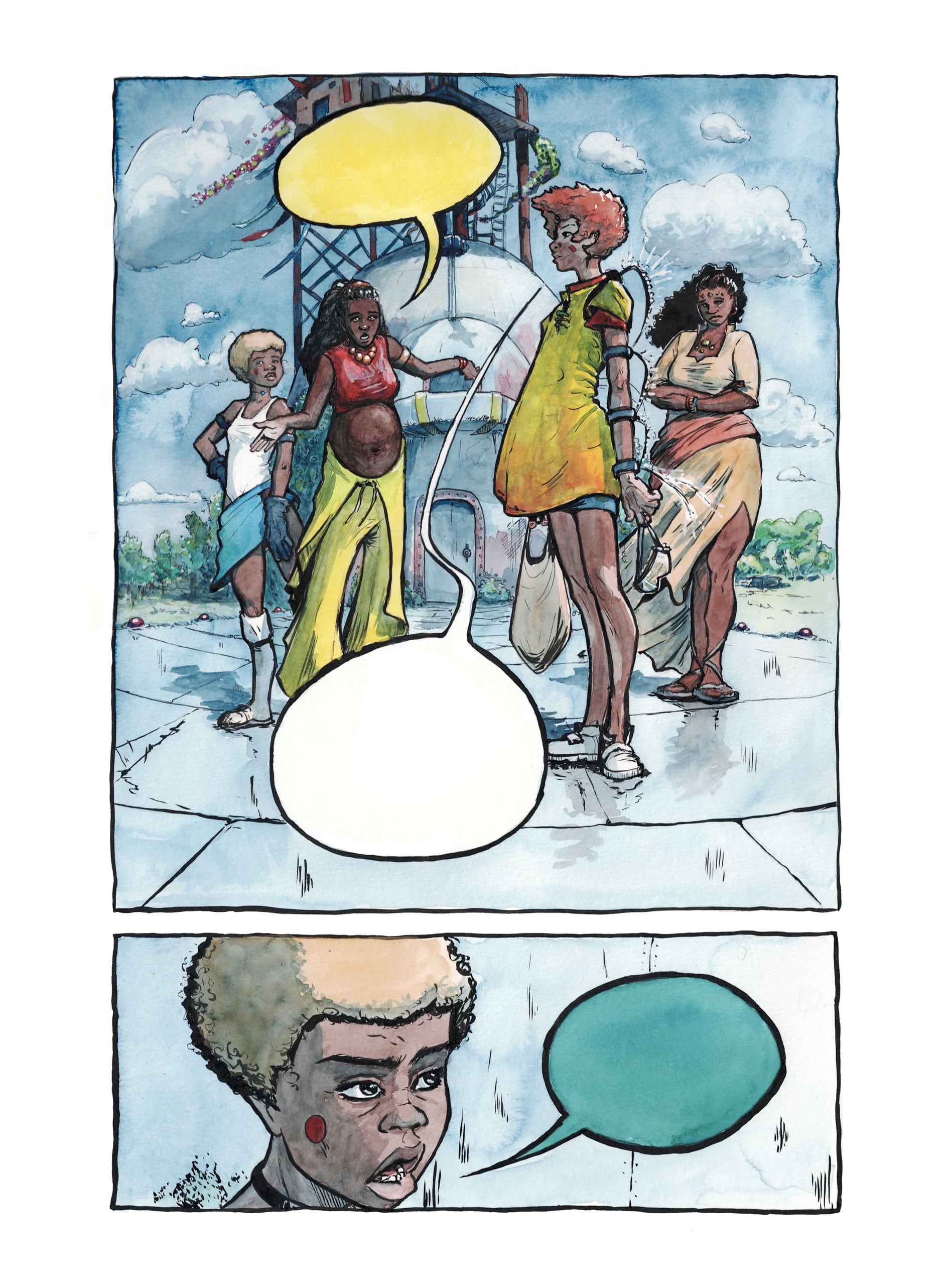
Well, I can definitely say I like this particular page.
this looks very promising
Thank you @sevenfivel and @LCT_m_a_d ! Your input is always helpful
Again considering a change for the next chapters. Thinking of a more vertical, traditional page format, probably more panels and text on each, what do you think? Would it be better to read in here?
Olô Franz, tudo bem? Passando para avisar que a continuação de subentendido está em construção, e para agradecer o apoio :3
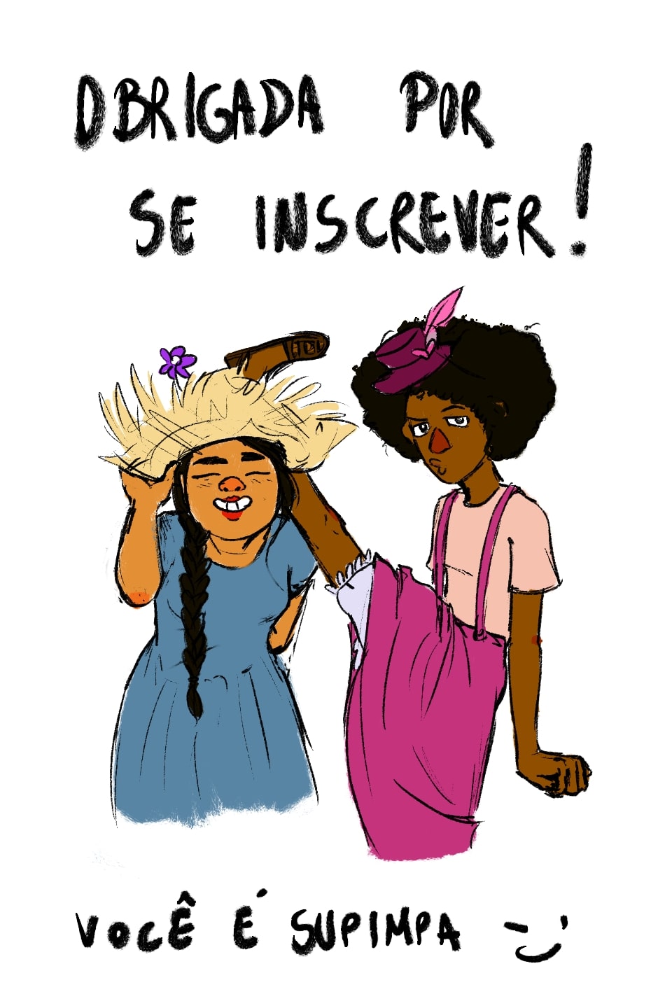
Aaah que ótimo! haha obrigado pela mensagem!
Readers of Abismos, please help me out. Would it take too much away from the reading experience if the comics are black and white? Do you feel like color is a bit part of it?
While I like the color, the comic already has a bit of a monochrome feel to it, so having it in black and white might not make too big of a difference. A side by side comparison of a panel with and without color might be helpful. . . .
i think for you drawing gray takes as much as if not even more time than colour the work too. Thought people do like to look at grey works, they also like coloured ones too.
@sevenfivel and @Hikari thanks for the input!
I just scheduled 6 new pages to publish here. I hope you enjoy the updates! Do you prefer batches of pages at once or page by page like this?
Taking a break on weekly updates. In general, I have been a bit overwhelmed and was really stretching myself. As a result I was not enjoying the quality of the last few pages are worked on. I will take time to rest and breathe. Thank you for subscribing and engaging with the content!
For anyone not following me on social media, I took a shot in participating on #tapasmermaychallenge with a mermaid version of Cer-Zay, the character that debuts in chapter 3:
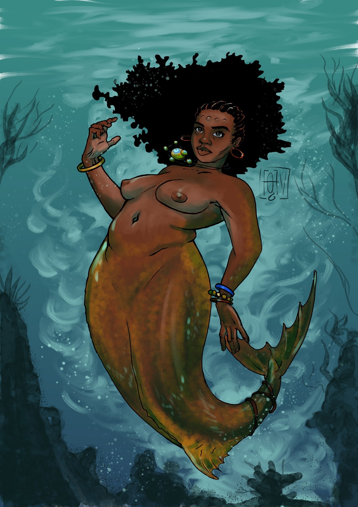
Glad you like it!
I saw your participation, and I must say that your art style is truly magnificent
Thank you so much :)
omg love it <3
Thanks :)

